+
Welcome to my homepage!
+Who am I?
++ I'm Lukas, a german student doing software development and more cool sciency stuff and this is my webpage where I want to showcase some of my work. +
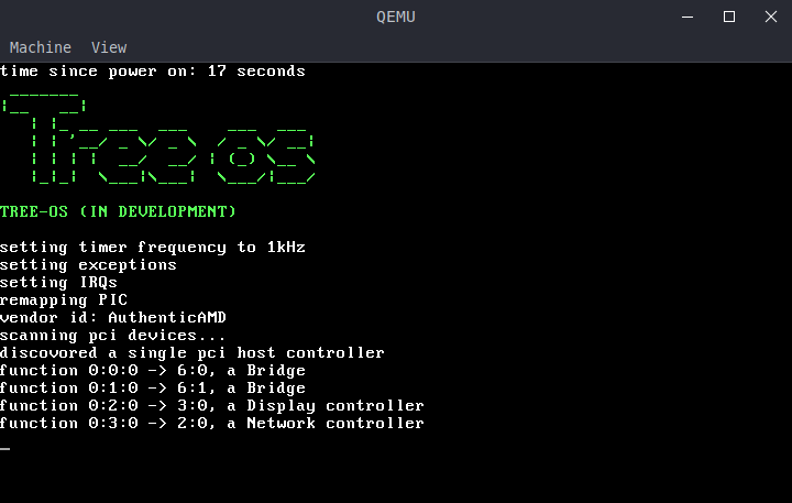
+Tree-os
+ +
+
+
+ + Tree os is a hobby operating system I mainly develop just for the learning experience. As of now, it supports some multitasking and I am currently in the process of adding a file system and can already read files! +
++ I took most of my knowlege from the exellent OS dev wiki, wich, despite not having actively been updated for years still contians lots of accurate information. This is because most of the old standards + like the x86 instruction set are still in use to this day and newer standards, x86_64 are mostly if not completly backwards compatible. +
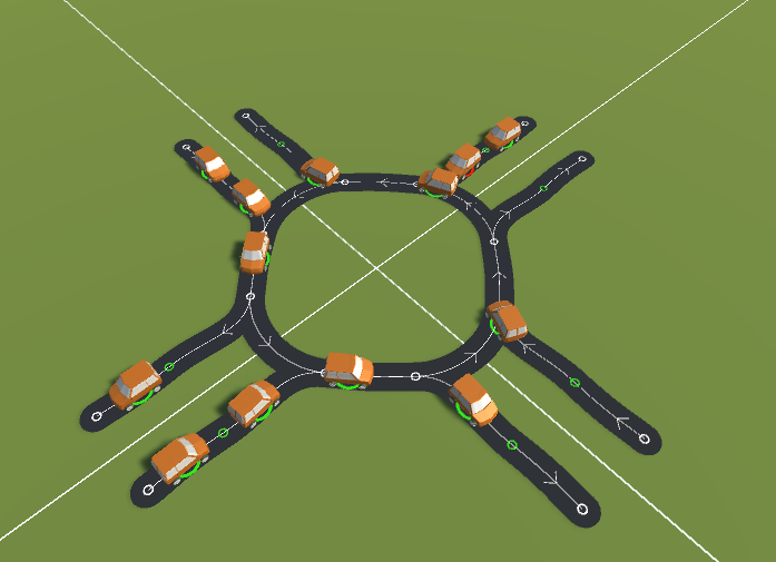
+Traffic simulator
+ +
+
+
+ + For school, I have to write a scientific article about something regarding "everyday physics". I am focusing on the design of urban junctions and need a simulation for cars traversing different designs. You can find the current code + on my git. +
+Websites
++ I personally created this website you are currently looking at using Angular and the Material design theme. Additionally, I also created Frank Eisenhauer's webpage and host an instance of gitBucket. +
+